
Sketching landscapes, intuition & a winter sky.
Trying something new, from scratch can be daunting. I don’t feel at all confident drawing real subjects that are in front of me so I’m challenging myself to do exactly that. Why? Because I’d love to be able to draw landscapes. Simply to record in my art journal what I see on my walks for the pleasure of the memories.
I thought I’d share with you some (very!) rough sketches of my drawing experiments for two reasons. Firstly, I feel it’s really important to show ‘ugly’ art to reassure you that ‘ugly’ is where we all start when making art and is a frequent visitor at absolutely every skill level after that. Secondly, that ‘ugly’ art may not be picturesque but it has a lot of value if you let it help you.

I was using a photo as reference and trying to work out the lights and darks. The photo had a lot of complicated greenery in it and I was finding it quite bamboozling.
The top sketch was the first, the bottom one was the second.
Even though I was disappointed with the first sketch, I wanted to finish the drawing session feeling motivated to have another go so I asked myself what I didn’t like about it and what I could do to improve it. You can see my handwritten notes for the next time to the left of the sketch . There are reminders of the order of drawing and four options to try regarding shading.
The second sketch shows some of those options put into practice: smoother/softer shading, less busy/complicated greenery, but not what I was aiming for.
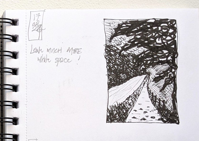
In the third sketch I experimented using only black ink to see if that would help me simplify the light and dark areas.
But no, and I resorted to using capitals letters in my note to emphasise what I needed to pay attention to next time!
What could I do to make this easier? The photo was a mass of greens so I wondered if using a photo editing app to convert it to a black and white image would help.

I tried that for this fourth sketch.
And it did make a difference to the amount and density of shading and I made note of some filters that would be worth a try for the next time.
You can see that I was much happier with the bottom right corner and when I look at that ‘yay!’ I feel the elation all over again!
At this point I was wondering what else I could try to help so I Googled ‘simplifying complex landscapes’ and found all these options: the cut paper filter in Photoshop, using a black felt tip pen to only block in the darkest areas, to imagine abstracting the shapes of the trees, shrubs and hedges, to turn the photo upside down to draw it, to draw only using straight lines, to draw quickly, to identify the elements that initially drew my attention and crop the image to focus on those and remove a lot of unnecessary complexity.
So, next time, I think I’ll draw lots of thumbnail sketches to test these out, perhaps using a different photo to encourage a new perspective and then come back to the original one.
Nature notes:

Sky or sea?
Winter skies seem much more interesting when there’s less colour in the landscape.
What I’ve been watching:
“Mad Men” the American TV drama about the ad men in 1960’s Manhattan. I’ve come very late to this series, I know, and I was shocked by all the smoking and drinking at work! Was it really like that?
What I’ve been reading:
“Intuition as Emergence: Bridging Psychology, Philosophy and Organizational Science”, an article by Paola Adinolfi and Francesca Loia on the growing relevance intuition has in the context of top management decision-making. At last, intuition is being recognised as an asset. You can read the article here.